ILLUSTRATION CONTEST 2024
2nd Pokémon Card Game
Illustration Grand Prix—Final Results
This contest has ended.
Theme: “Pokémon’s Cool Moments”
First Place
次郎 さん
(Jiro Sasumo)
Artist’s comment
Judge's Comments
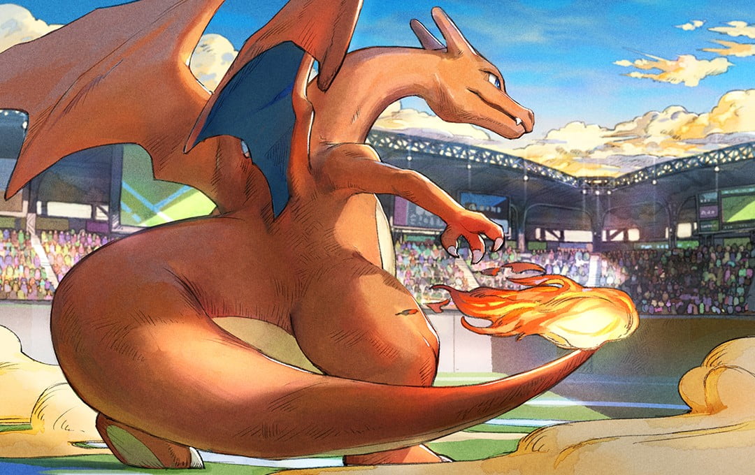
The way in which the flames on the tip of Charizard’s tail let you see the air flowing around it and the way the dust dances at its feet are absolutely wonderful. I really like the choice of colors for the clouds and the shadow hitting the stadium, as they really make you feel the depth and atmosphere. Charizard is often drawn in very dynamic poses, but the stillness of this illustration makes one anticipate the fierce battle that will ensue soon after.
The illustration beautifully portrays Charizard's heaviness and the tension before a battle. Most of the entries showed very dynamic renditions, but the elegant stillness of this one made it particularly striking. The composition and drawing details are also exquisitely thorough.
It is very cool to see Charizard going to battle like this. It is a meticulously drawn illustration that also includes details in the lighting, coloring, and intricate hatching.
2D Illustration Excellence Award
楠木 燦 さん
(Sun Kusunoki)
Artist’s comment
Thank you for choosing my illustration. I am deeply honored. I was very happy that Wishiwashi, a Pokémon I love, was selected for the “Pokémon’s Cool Moments” subject. I will treasure the memory of this award for the rest of my life. I will continue to devote myself to drawing pictures that everyone can enjoy. Once again, thank you so much.
Judge's Comments
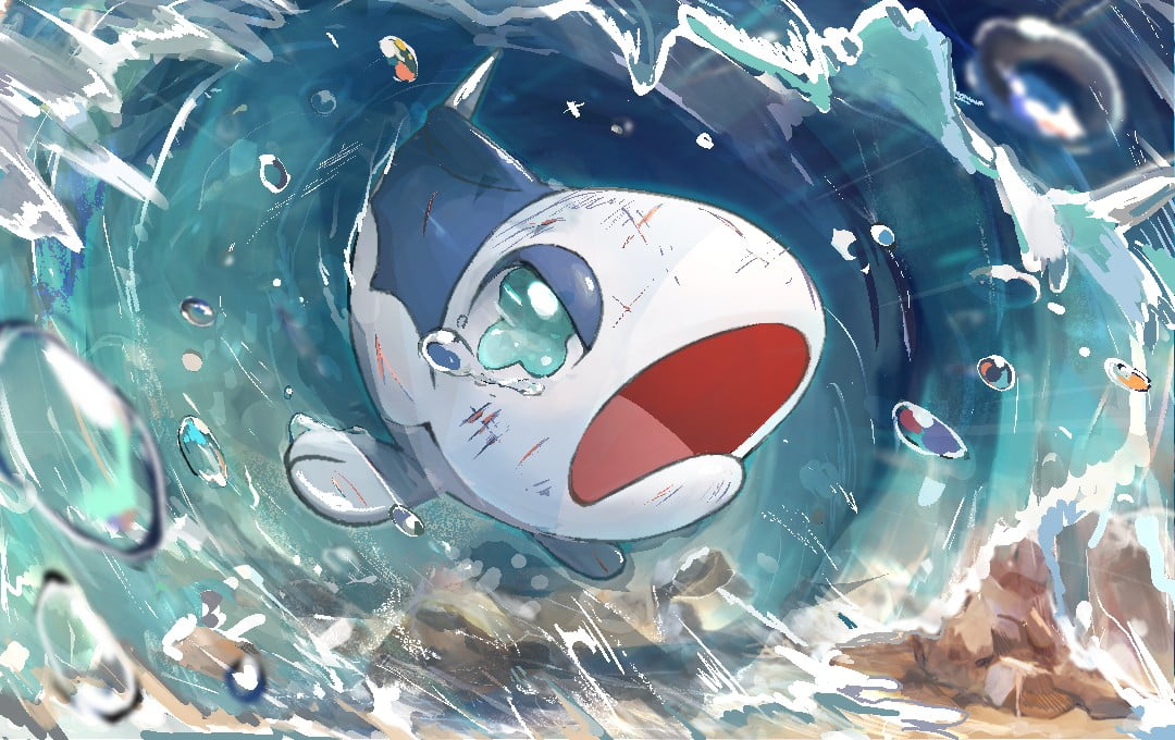
Among the many Wishiwashi entries, this one was particularly dramatic. The wall of water and the sea floor are drawn with a rough touch that I think matches very well with the situation in which Wishiwashi is placed.
This very emotional illustration manages to use Wishiwashi’s scratches and its expression to hint at a larger story from a single still picture. Is it trying to save some of its friends? I can’t help but wish I could know how Wishiwashi’s story unfolds. The background is drawn rough, but I think it perfectly captures the three-dimensionality and transparency of water.
The tears flowing from Wishiwashi’s eye and the wounds on its body depict really well the way in which it has fought through many hardships.
3D Illustration Excellence Award
takuyoa さん
Artist’s comment
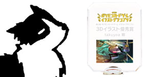
I have always loved the illustration of Pokémon cards and, thinking of how fun it would be to be able to draw one of them, I’ve been practicing drawing them over and over.
I am very honored that all this practice bore fruit and very grateful for this award.
I feel like this is a huge achievement for me, but I will keep practicing to get even better.
Judge's Comments
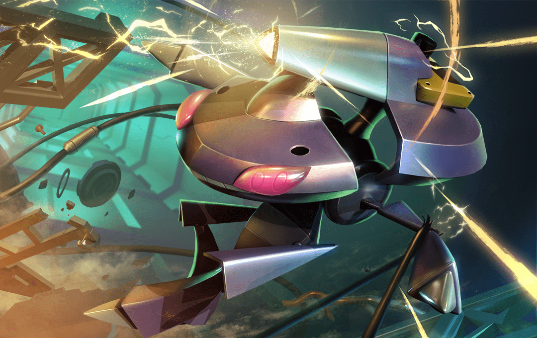
The torn cables, the debris, and the pose really make the Genesect in this illustration feel dynamic.
The depth of the composition really caught my eye. The details of Genesect’s body are also very well balanced and scaled. The shapes are clean without being simplistic, and the textures are very realistic.
The blue lighting of the research facility in the background and the yellow light of Genesect’s beam create a very cool color contrast.
Judge's Prize (Five Selected Entries)
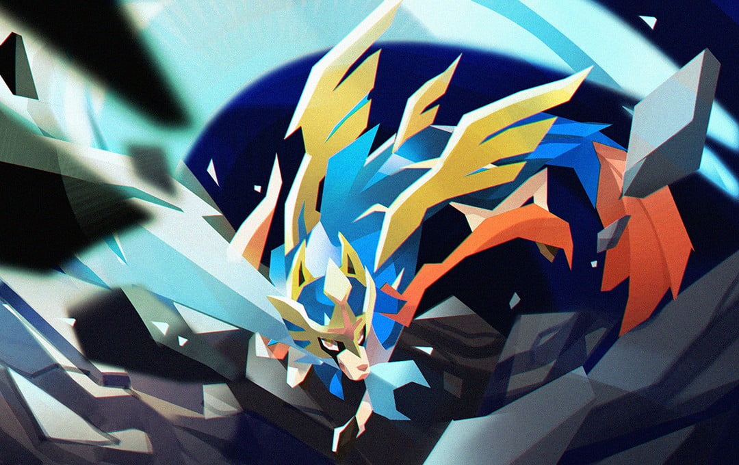
ヒダヤト リアンティ さん
(Rianti Hidayat Wong)
Judge's Comments
The bold slashing trajectory and unique touch are stylish and very cool. At first glance, it is simple, but it captures the Pokémon’s features, and it achieves a level of completeness unique to a drawing style as stylized as this one.
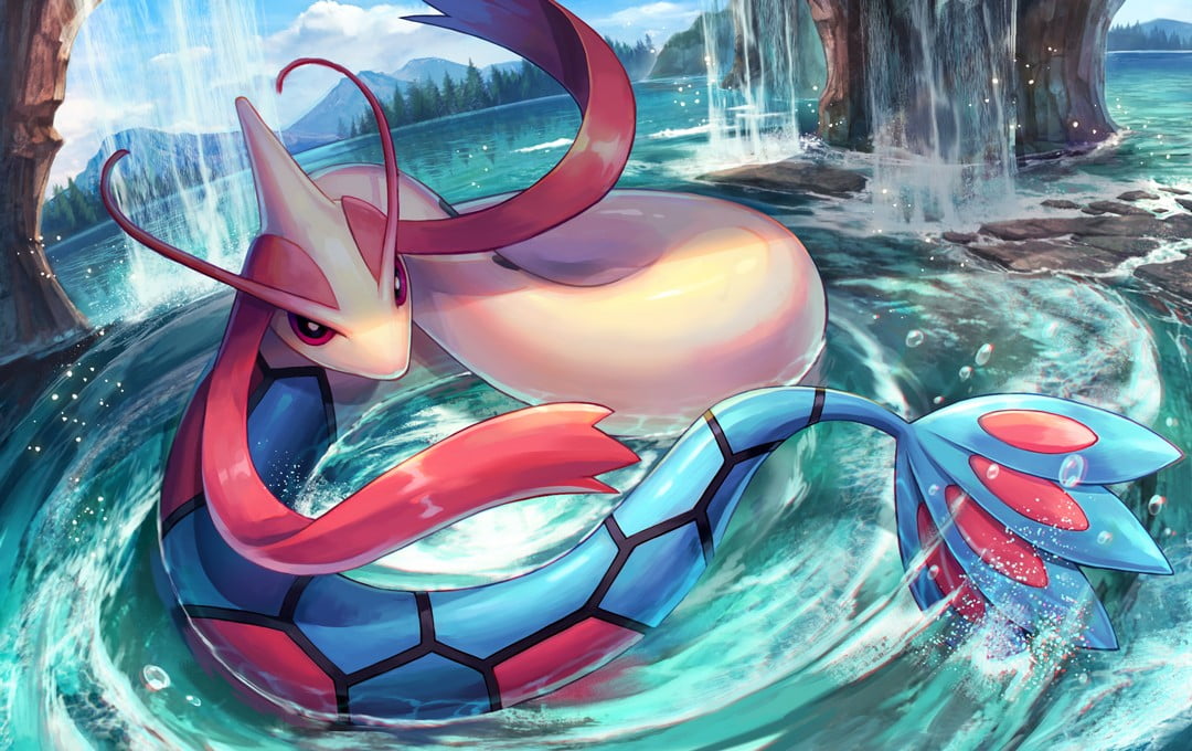
白砂かに さん
(Kani Shirasuna)
Judge's Comments
The blue-based landscape and Milotic’s stare are mesmerizing. The carefully drawn composition and detailed background emphasize the size and presence of Milotic.
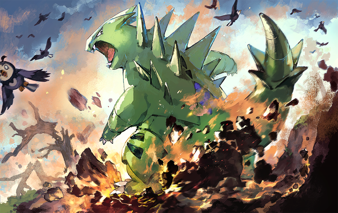
スズキイオリ さん
(Iori Suzuki)
Judge's Comments
The peculiar touch of this illustration produces a unique atmosphere. The firm brushing technique has a lot of momentum, but it never ends up feeling rough, showing an impressive amount of skill.
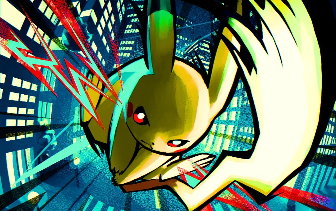
ノズル さん
(Nozuru)
Judge's Comments
It is unusual to see the color red being used in a Pikachu illustration, but here, it is used as an accent to great effect, resulting in a very stylish image.
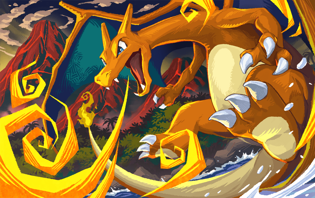
雉本 ユーヒ さん
(Yuhi Kijimoto)
Judge's Comments
The three-dimensionality of the composition that makes you feel like you could touch Charizard’s paw, together with its cute expression, create a nice contrast.
Effects like the hatching on Charizard's wings show a great attention to detail and make for an interesting, unique touch.
I'm really happy to receive such a wonderful award!
I'm sure the same goes for a lot of people, but as a kid, I chose Charizard as my first Pokémon, which is why I’m so attached to Charizard, one of my favorites.
At first, I was worried about how to show Charizard in all of its coolness and the tension of the battle that is about to start. Then, I remembered how I always looked at it from behind in the game and how I associated this sight with its strength. That was the memory that allowed me to draw the illustration in a fun and exciting way.